Premium

Bring Attention to Product Features & Benefits in Minutes

Visually callout sections of a product or chart using this image callout module. Plot the X Y coordinates and add description text for each callout.

Module Demo FAQ Pricing Documentation


Module Demo

A

Feature 1

Callout description text
B

Awesome Feature 2

Callout description text
C

Unique Feature 3

Callout description text
 

Frequently Asked Questions

Features and Benefits

  1. Add an image and quickly add hotspots to callout key product features
  2. Works well on mobile and desktop devices
  3. Easy to customize the branding colors and fonts to fit your brand.

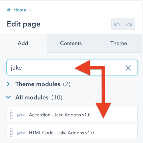
Steps How to add a Jake Addons custom module to a page.

  1. In your HubSpot account, navigate to Marketing > Website > Website Pages.
  2. Hover over a page and click Edit.
  3. In the content editor sidebar on the left of the window, locate the search box and type "jake"
  4. Next, select a module that appears in the All Modules section
  5. Click a module and drag it into position on the page.

How do I add this HubSpot module to a page?

Some pages you create will require an image gallery or tab content, but others will not. HubSpot modules give you the control to add new functionality to only the pages you need without impacting the rest of the pages on your website. These modules are added to drag-and-drop areas or sections when editing a page. If you are more familiar with WordPress, they are like blocks or plugins in that CMS.

HubSpot CMS Hub Overview

The content management system you need to easily create and personalize website pages for every visitor — optimized for conversion across every device. Rely on developers as much or as little as you’d like.

HubSpot CMS Hub Features

  • Drag and drop page editor
  • Image and file manager
  • Fully integrated CRM
  • Contact attribution analytics – know where leads come from
  • Multiple language support
  • Build website pages, landing pages, and blog posts
  • Managed website hosting and security

HubSpot CMS Hub Benefits

  • Marketing and Sales can have one login and tool for their website
  • Easy to use website builder without having to manage website hosting and plugins
  • Can make content translation and smart content to leverage your CRM data

Get Started

Have a question? Contact Me
 

Module Documentation

CONTENT TAB

General Settings

  • Product Image: The main background image where the callout markers will be placed.

  • Mobile - Hide Captions on Load

    • On: Captions are hidden initially on mobile devices.

      Off: Captions are visible immediately on mobile.

  • Desktop - Callout Layout: A choice field that determines where the text descriptions appear relative to the image on desktop screens (e.g., Left, Right, or Bottom).

  • Desktop - Show the First Callout: A boolean toggle.

    • On: The first callout automatically opens when the page loads.

    • Off: All callouts start closed.

  • Desktop - Show Title Tooltip on Hover: A boolean toggle.

    • On: Hovering over a marker dot displays the title as a small tooltip.

    • Off: No tooltip appears on hover.

Callout Items (Repeater)

  • Title : The short headline for the callout. This text is also used for the tooltip if that feature is enabled.

  • Description Text: A rich text field for the main content of the callout. It supports formatted text, links, and bullet points.

  • Image: An optional field for adding a detailed close-up or secondary image inside the callout description box.

  • XY Coordinates A text field defining the position of the marker on the Product Image.

    • Format: X,Y (e.g., 50.5, 20.0).

    • Usage: These values represent percentages from the top/left and are usually calculated automatically by clicking the image while in the page editor.

STYLES TAB

Style Settings

  • Marker Type: A choice field that determines the visual format of the indicators on the image (e.g., Numerical [1, 2, 3], Alphabetical [A, B, C], or Roman Numerals).

  • Marker Text : A font selector that controls the typography (font family, size, color) of the text inside the marker dots.

  • Marker Background Color: A color picker for the background fill of the marker dots.

  • Marker Pulse Animation : A choice field to control the animation effect of the markers (e.g., enabling a "pulse" effect to draw attention to the hotspots).

  • Image Border A border settings group that allows you to add and style a border around the main Product Image.

  • Caption Title Font: A font selector for the headline text inside the description/caption box.

  • Desktop Caption Background Color: A color picker that sets the background color of the description text box when viewed on desktop screens.

  • Tooltip Background Color: A color picker for the small tooltip popups that appear when hovering over a marker (if the tooltip feature is enabled).