Subheader
Main Headline
Subheader
Main Headline
Subheader
Main Headline
Subheader
Main Headline
Features and Benefits
- Drag and drop a module into a page to quickly add spacing between other modules or sections.
- Visually see the spacing when editing the page.
- Control if the spacing is vertical, horizontal, or both.
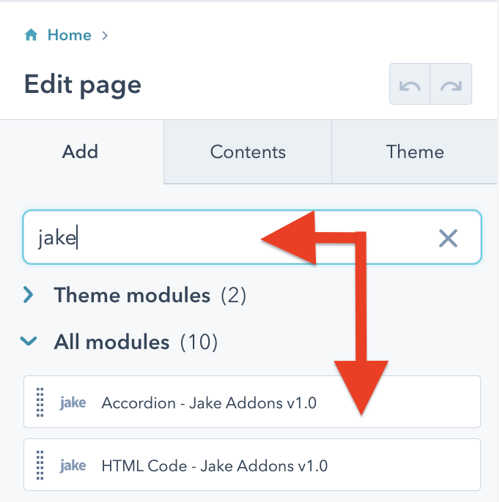
Steps How to add a Jake Addons custom module to a page.
- In your HubSpot account, navigate to Marketing > Website > Website Pages.
- Hover over a page and click Edit.
- In the content editor sidebar on the left of the window, locate the search box and type "jake"
- Next, select a module that appears in the All Modules section
- Click a module and drag it into position on the page.
HubSpot CMS Hub Overview
The content management system you need to easily create and personalize website pages for every visitor — optimized for conversion across every device. Rely on developers as much or as little as you’d like.
HubSpot CMS Hub Features
- Drag and drop page editor
- Image and file manager
- Fully integrated CRM
- Contact attribution analytics – know where leads come from
- Multiple language support
- Build website pages, landing pages, and blog posts
- Managed website hosting and security
HubSpot CMS Hub Benefits
- Marketing and Sales can have one login and tool for their website
- Easy to use website builder without having to manage website hosting and plugins
- Can make content translation and smart content to leverage your CRM data
Get Started
When you add the module to the page, you will see the default text and images in place. The card with text that overlaps the image contains three text fields you can edit. The text is in individual blocks instead of one rich text block to keep design consistency in check across your website pages.
Ok, now let's look at what you can edit and what the fields mean. Each module has two main tabs. Content and Styles. I recommend adjusting the content tab first and then once you have that set move on to the styles tab to make visual refinements.
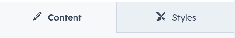
Content
Text Block (Top Middle Bottom)
If you don't want a block of text to appear, delete the text, and it will not display.
Button
Click on the button text to open the hidden editable options.
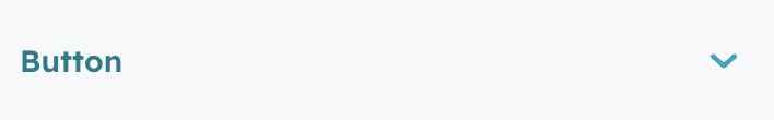
You can now enter your button text, URL, and button CSS classes. Your theme might not use the default HubSpot button class names and so you will need to find what your theme uses. Watch this tutorial video for instructions on how to find a button's CSS class name using the Inspect Tool in Chrome Developer Tools.
To hide the button, simply delete the button text and it will be removed.
Image
Click the replace link to replace the default image. You can then adjust your image size settings as you see fit. You can also specify if you would like the image to load lazy or eager.
Advanced
This field allows you to change the module's default ID. By default, the ID is a shortened version of the middle text block text. You would use this ID for linking directly to this module on the page. Commonly named a jump menu, like https://yourdomain.com/pagename#uniqueanchorname
Styles
Presets
Desktop Card Alignment
This is where you can set the horizontal alignment of the content card. By default, it is aligned to the right.
Content Card Stack Order
Just like a stack of playing cards, you can specify if you want the content card to be above or below the image.
Text Block (Top Middle Bottom)
Each text block has the same set of editable options. These include the following:
Text
Font
If you leave this unchanged, the text will be styled using your theme styles set for the HTML tag you select in the next field. If you want to override that, change the font and font color with this field.
HTML Tag
Select the HTML tag you would like to use to benefit from SEO and page hierarchy. Read this article if you need help deciding what heading to use.
Spacing
Margin / Padding
Adjust the spacing around your text with these fields. You can add one value to apply to the top, right, bottom, left sides of the text. or adjust values for each side.
Alignment
Horizontal alignment
Choose how you would like the text to be aligned in the content card.
Button
Text
Font
Adjust the text styles in the button. This will override any text styles set by your theme button class specified in the content tab.
Spacing
Margin
Adjust the margin around the text in the button. This will override any margin set by your theme button class specified in the content tab.
Padding
Adjust the padding around the text in the button. This will override any padding set by your theme button class specified in the content tab.
Alignment
Horizontal alignment
Set the alignment of the button.
Card Container
Spacing on Mobile
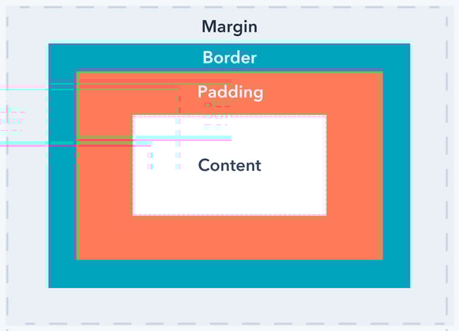
Adjust the margin and padding for mobile and desktop devices. Below is a screenshot show the difference between padding and margin.
Background Color Desktop
Add a background color for desktop. You can use opacity to create a layering effect.
Background Color Mobile
Add a background color for mobile devices. You can use opacity to create a layering effect.
Border
Do you want the content card to have a border? If so enter the pixel value here.
Border Radius
Do you want the content card to have rounded corners? If so enter the pixel value here.
Overlap Amount Mobile
Enter the pixel amount of overlap you would like to have on mobile devices.
Overlap Amount Desktop
Enter the pixel amount of overlap you would like to have on desktop.
Container
Spacing on Desktop
On mobile the container spacing is removed and goes full width. You can set the spacing on desktop with this field.
Background Color
Specify the color you would like to use for the container.
Advanced
Decrease Mobile Font Size
To save vertical space on mobile devices, you could set a percentage to decrease the font sizes on mobile only


