When you add the module to the page, you will see the default text in place.
Ok, now let's look at what you can edit and what the fields mean. Each module has two main tabs. Content and Styles. I recommend adjusting the content tab first and then once you have that set move on to the styles tab to make visual refinements.
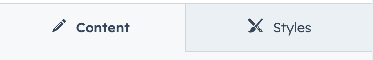
Content
Text Block (Top Middle Bottom)
If you don't want a block of text to appear, delete the text, and it will not display.
Advanced
This field allows you to change the module's default ID. By default, the ID is a shortened version of the middle text block text. You would use this ID for linking directly to this module on the page. Commonly named a jump menu, like https://yourdomain.com/pagename#uniqueanchorname
Styles
Presets
Desktop Card Alignment
This is where you can set the horizontal alignment of the content card. By default, it is aligned to the right.
Content Card Stack Order
Just like a stack of playing cards, you can specify if you want the content card to be above or below the image.
Text Block (Top Middle Bottom)
Each text block has the same set of editable options. These include the following:
Text
Font
If you leave this unchanged, the text will be styled using your theme styles set for the HTML tag you select in the next field. If you want to override that, change the font and font color with this field.
Uppercase
Instead of manually writing your text in all caps you can just check this box to make your text uppercase.
HTML Tag
Select the HTML tag you would like to use to benefit from SEO and page hierarchy. Read this article if you need help deciding what heading to use.
Line Height
When your text is long and wraps to a second or third line you will notice the need to adjust the line height. This is the web version of leading using in print design. It adjusts the height of the ascender and descender of your text so they don't overlap.
Letter Spacing
This is like tracking in print design. It is the space between all characters in the text block. You can use this to tighten or broaden the space.
Background
By default your text will use your font color, but what if you want your text to have a texture or gradient fill? This option set will help you apply a text background.
Background Type
First choose your text background type: none, image, or gradient. If you select an image it will be added and cropped inside your text.
Spacing
Margin / Padding
Adjust the spacing around your text with these fields. You can add one value to apply to the top, right, bottom, left sides of the text. or adjust values for each side.
Alignment
Horizontal alignment
Choose how you would like the text to be aligned in the content card.
Line
Border
First choose the line border style and color.
Width
Adjust the thickness of the line
Length
By default, the line will be the full width of the container. But you can adjust this to be an exact length if you want.
Placement
Specify where you would like the line to appear.
Background
Image Placement
Specify where the container background image will be placed relative to the container.
Image
Upload or browse for the image you would like to place in the container.
Image Opacity
Since you are placing this image behind the text, you can adjust the image opacity if you needed to improve readability.
Border Radius
Do you want the container to have rounded corners? If so enter the pixel value here.
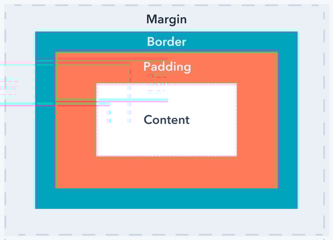
Spacing
Adjust the margin and padding for mobile and desktop devices. Below is a screenshot show the difference between padding and margin.
Advanced
Decrease Mobile Font Size - Top | Middle | Bottom
Enter a pixel font size for the different text sections. The font size will apply on device widths of 768px and below.


