Icon & Text Module
Hundreds of Icons to Choose From
Add This Icon & Text Module to Your HubSpot Page to Showcase Features or Service Offerings for Your Business.
Steps How to add a Jake Addons custom module to a page.
- In your HubSpot account, navigate to Marketing > Website > Website Pages.
- Hover over a page and click Edit.
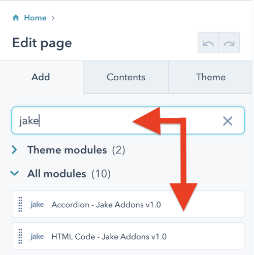
- In the content editor sidebar on the left of the window, locate the search box and type "jake"
- Next, select a module that appears in the All Modules section
- Click a module and drag it into position on the page.

Content
Choose Icon Library: Choose the icon library you would like to use: Ionicons, FontAwesome, Feather, Material, Pixel IMG, or Vector SVG
Icon Class Name (optional): Depending on what library you select, most of them require a specific class name. Enter it here to choose the correct icon to display
Icon Height: Set the icon height in pixels. Default value is 50.
Icon Alignment: Choose the icon alignment
Icon Description Text: Enter description text under the icon if needed
Button Text: Add the text for the button. To hide the button, remove this text.
Button Link: Add the link used in the button
Style
Icon Color: Change the icon color
Button
Font: Change the button font. By default, the button inherits the theme body font.
Background Color: Change the button background color. By default, the button inherits the theme's primary color.
Alignment: Set the button alignment.
Background Color Hover: Change the button background color when the button is hovered over with a mouse pointer.
Spacing: Set the margin and padding around the button element.
Border Radius: Add a border radius around the button element.


