Free

Hundreds of Icons to Choose From

Add This Icon & Text Module to Your HubSpot Page to Showcase Features or Service Offerings for Your Business.

Module Demo FAQ Get FREE Module Documentation


Module Demo

Ionicons

A short description of the icon. Could be used to describe a service you offer.

FontAwesome

A short description of the icon. Could be used to describe a service you offer.

Feather Icons

A short description of the icon. Could be used to describe a service you offer.
email

Material Icons

A short description of the icon. Could be used to describe a service you offer.
Screen Shot 2023-05-06 at 5.18.46 AM

Pixel Image

A short description of the icon. Could be used to describe a service you offer.

Custom Vector SVG

A short description of the icon. Could be used to describe a service you offer.
 

Frequently Asked Questions

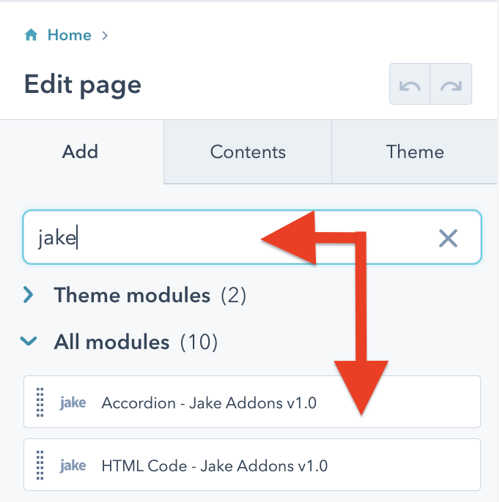
Steps How to add a Jake Addons custom module to a page.

  1. In your HubSpot account, navigate to Marketing > Website > Website Pages.
  2. Hover over a page and click Edit.
  3. In the content editor sidebar on the left of the window, locate the search box and type "jake"
  4. Next, select a module that appears in the All Modules section
  5. Click a module and drag it into position on the page.

How do I add this HubSpot module to a page?

Some pages you create will require an image gallery or tab content, but others will not. HubSpot modules give you the control to add new functionality to only the pages you need without impacting the rest of the pages on your website. These modules are added to drag-and-drop areas or sections when editing a page. If you are more familiar with WordPress, they are like blocks or plugins in that CMS.
Have a question? Contact Me
 

Module Documentation

Content 

Choose Icon Library: Choose the icon library you would like to use: Ionicons, FontAwesome, Feather, Material, Pixel IMG, or Vector SVG

Icon Class Name (optional): Depending on what library you select, most of them require a specific class name. Enter it here to choose the correct icon to display

Icon Height: Set the icon height in pixels. Default value is 50.

Icon Alignment: Choose the icon alignment

Icon Description Text: Enter description text under the icon if needed

Button Text: Add the text for the button. To hide the button, remove this text.

Button Link: Add the link used in the button

Style

Icon Color: Change the icon color

Button

Font: Change the button font. By default, the button inherits the theme body font.

Background Color: Change the button background color. By default, the button inherits the theme's primary color.

Alignment: Set the button alignment.

Background Color Hover: Change the button background color when the button is hovered over with a mouse pointer.

Spacing: Set the margin and padding around the button element.

Border Radius: Add a border radius around the button element.