Responsive Image Picture Element
Art Direct Your Images on Different Screen Sizes
Adding a responsive image is made easy with this picture element module for HubSpot CMS.
Similar to the default HubSpot image module but it gives you more control on how the image appears on various screen sizes. You can art direct and change out the image layout or content to fit your mobile or desktop layouts. This is also helpful when you have text baked into the image and you want to control the size of the text on the different screen sizes. Otherwise, your text will be super small on mobile and large on desktop. This module gives you the fine-tuned control to fix that.
Resize your window width to see the image below change.


Features and Benefits
- Control how your image looks on different screen sizes.
- Add links to image if you need to.
- Could be used for a header banner with text and graphics embedded into the image.
Steps How to add a Jake Addons custom module to a page.
- In your HubSpot account, navigate to Marketing > Website > Website Pages.
- Hover over a page and click Edit.
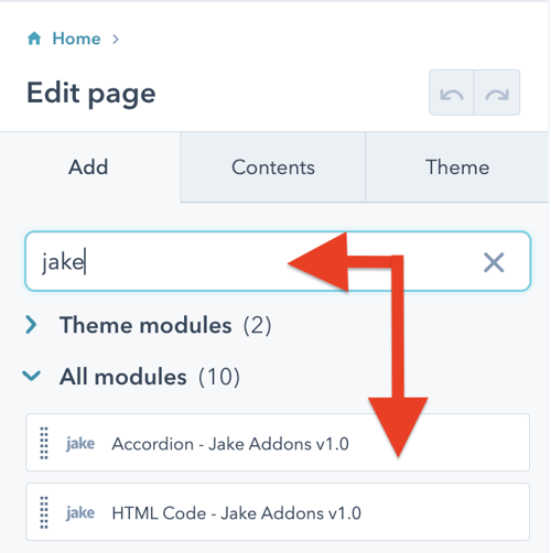
- In the content editor sidebar on the left of the window, locate the search box and type "jake"
- Next, select a module that appears in the All Modules section
- Click a module and drag it into position on the page.

HubSpot CMS Hub Overview
The content management system you need to easily create and personalize website pages for every visitor — optimized for conversion across every device. Rely on developers as much or as little as you’d like.
HubSpot CMS Hub Features
- Drag and drop page editor
- Image and file manager
- Fully integrated CRM
- Contact attribution analytics – know where leads come from
- Multiple language support
- Build website pages, landing pages, and blog posts
- Managed website hosting and security
HubSpot CMS Hub Benefits
- Marketing and Sales can have one login and tool for their website
- Easy to use website builder without having to manage website hosting and plugins
- Can make content translation and smart content to leverage your CRM data
Get Started
Documentation
Content Tab
Desktop Image
Image : Add your image to display on desktop devices. This image includes controls to adjust the loading type as well as the alt text.
Keep in mind, these sizing controls and loading values are used for tablet and mobile screen sizes. The mobile and tablet image fields just ask for the image source.
Tablet Image (optional)
Image : Add your image to display on tablet devices
Mobile Image
Image : Add your image to display on mobile devices
Link : If you want to link the images you can do so here.
Styles Tab
Spacing: Adjust padding and margin around your image
Border Radius: Add rounded corners to your image


